EDIT: The previous post: http://nayrb.org/~blog/2016/01/18/analysis-fractional-home-ownership/ got the most feedback ever (other than the immediately preceding one about facebooking pictures of your kids). It turns out that all you need to do to get lots of comments is to make a post with an incorrect and not-completely-thought-out graph, and everyone eagerly posts corrections and ideas. (It was actually a really fun discussion… 😀 )
– SG mentioned that the curve of the graph is likely off, suggesting a convex curve and swapping the axes, also suggested looking up Michael Raynor and Clayton Christensen.
– AB asked exactly where fractional ownership fit on the graph (my statement was it could fit anywhere on the graph, but that’s not really that helpful, is it. 😀 )
– PD (among others) pointed out that I somehow missed labeling the X-axis (it’s ‘ownership’, which is not quite correct, it should be ‘negative ownership’ or something similar, and it got lost in the .dwg to .png translation)
– DR brought up a kind of ownership which exists in Montreal called ‘divided ownership’, which is a form of co-ownership where a group of people own a building
So, to address these comments:
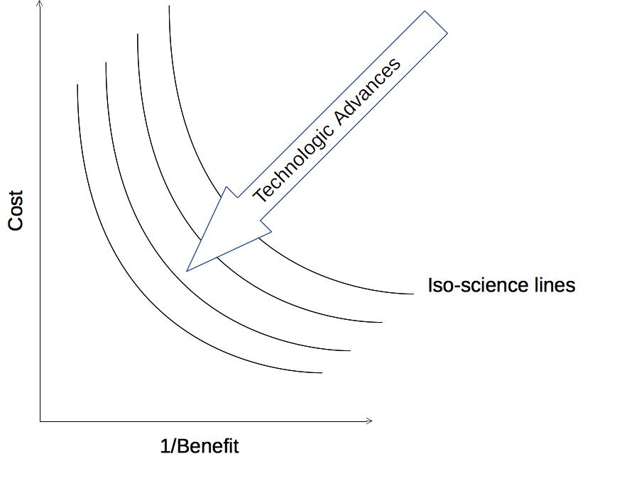
Interestingly, I had always pictured tradeoff diagrams like so:
Where your goal was to get as close to the line which represented the current best technology. (I’ve called these ‘iso-science lines’, for lack of a better term. More on these later.) This way of looking at it also suggests that there’s a ‘good enough’ for your application, that your science/technology may get you closer and closer to infinity, but most of your users will likely not care. (This may be most useful for consumer commodities.)
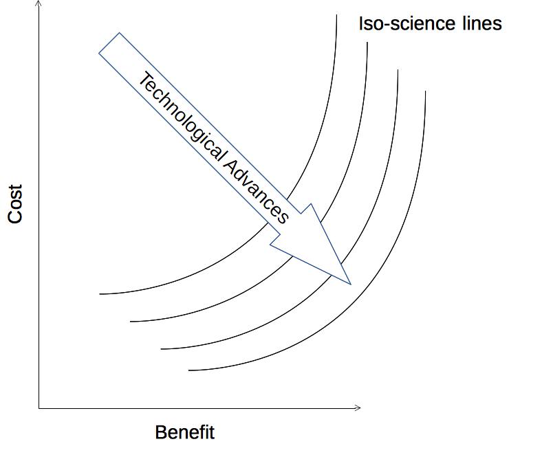
You might find the following graph more useful. It jibes better with my mental model of commodity CPU performance curves from when I was growing up.:
This has benefit increasing without bound, which may be more useful for many other applications. You could also see how the curves could have technological advances more in the cost or benefit directions, such as how the 787 looks very much like the 767. It’s much more fuel efficient, but travels at about the same speed:
http://idlewords.com/talks/web_design_first_100_years.htm
Anyways, back to fractional house ownership. I’m not entirely sure how to measure the utility of different types of housing ownership…You could look at financial benefits over time, but what horizon do you look over? You could look at the ‘pride of ownership’, but that is difficult to quantify.
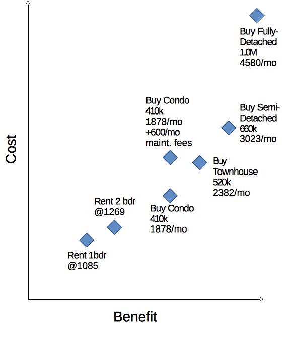
But I had to quantify it somehow, so I put a condo at about twice the ‘utility’ as an apartment, then townhouse, semi-detached, detached linearly improving from there*.
As you can see, you get a similar diminishing returns curve as we saw before, but that could just be because we were looking for/expecting that.
Let me know what you think in the comments! 😀
Data from:
5-year variable rate of 2.7% from:
https://www.tangerine.ca/en/borrowing/tangerine-mortgage/index.html
Average rental rates of 1 bedroom $1085 and 2 bedroom $1269 from:
Average house prices of:
– Condo 410k (1878/mo @ 2.7%+ condo fees of about $600/mo)
– Townhouse 520k (2382/mo @ 2.7%)
– Semi-detached 660k (3023/mo @ 2.7%)
– Detached 1.0M (4580/mo @ 2.7%)
http://www.thestar.com/business/2015/09/04/average-gta-house-price-up-10-in-august.html
http://www.huffingtonpost.ca/2015/02/19/condo-fees-toronto-canada_n_6714396.html
*Utility:
– Renting 1-bedroom apartment: 2
– Renting 2-bedroom apartment: 3
– Purchase of Condo: 5
– Purchase of Townhouse: 6
– Purchase of Semi-detached: 7
– Purchase of Detached: 8


There was a question on facebook about fractional ownership of one’s primary dwelling (as opposed to for an investment property). My answer was:
I see it as a detachment of the ‘occupation cost’ and ‘ownership cost’ of a dwelling. You could purchase 5% of the building you live in, or possibly a
rent-to-own model. If you couldn’t get a mortgage for your dwelling, but could invest slowly in purchasing it with cash?